QGIS: Data visualization
Motivation
Some crowdsourced bathymetry participants may have a clear idea of how they intend to use the depth soundings they've collected and what data format best suits that purpose. Others may benefit from a simple tutorial on how to visualize their data using a free, open-source software (QGIS).
This will allow the Trusted Node to return data to participants in the .shp file format and ensure that participants can easily visualize their contributions to the program. This option may be particularly valuable to newly established Trusted Nodes that have not yet constructed an ArcGIS Hub site (e.g., Crowd the Bay) or similar platform for public CSB data access.
Tutorial
- You will first need to download QGIS. (If needed, installation instructions are available here).
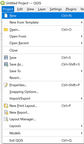
- Launch QGIS. Click on the Project tab and select 'New' to open a blank map. Make sure to save your project with an appropriate name.
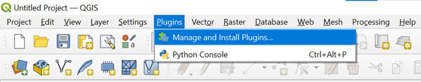
- Click on the Plugins tab and select 'Manage and Install Plugins.'
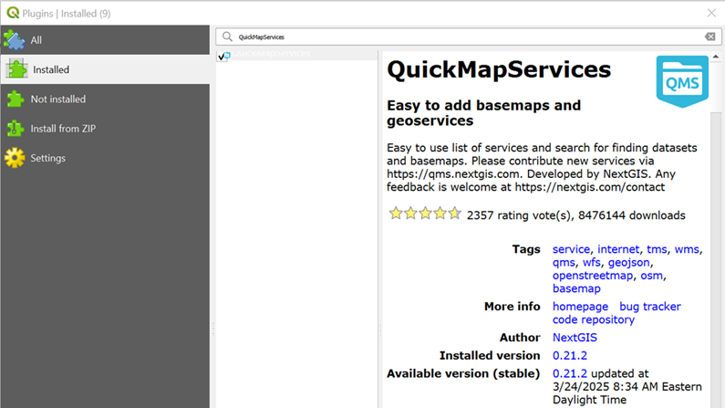
- Search for and install the QuickMapServices plugin.
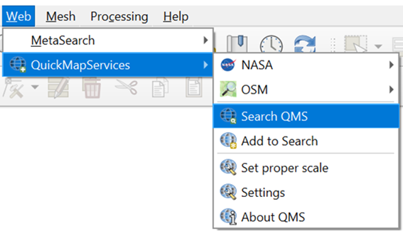
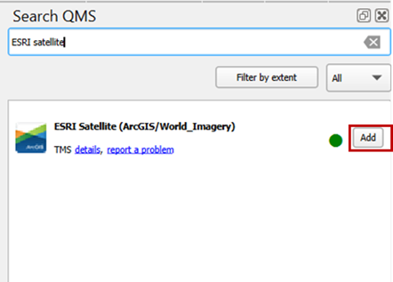
- Under the Web tab, select QuickMapServices and click on 'Search QMS.'
- Search for ESRI Satellite (ArcGIS/World_Imagery) and click 'Add.'
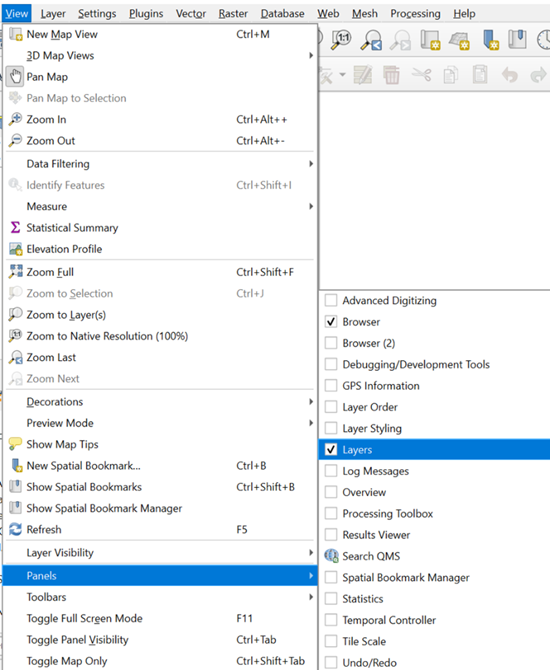
- Under the View tab, click Panels and turn on the 'Layers' option.
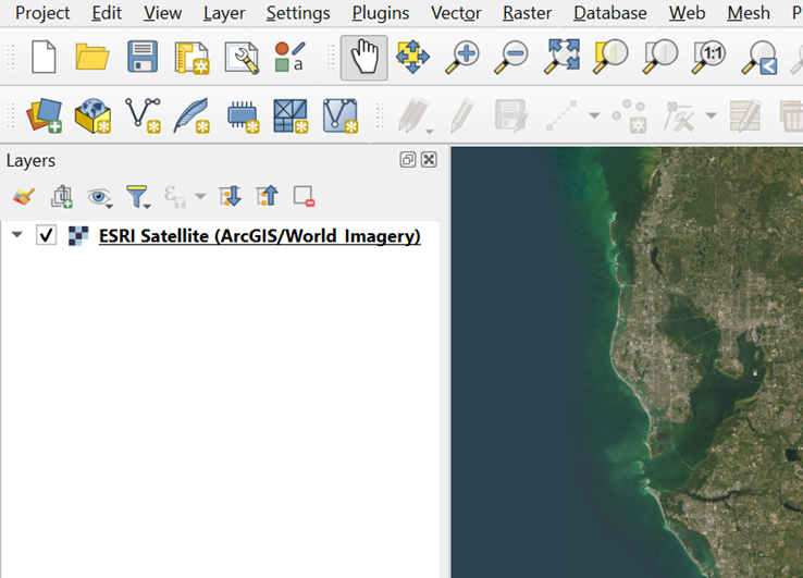
- In the Layers panel, check the box for ESRI Satellite (ArcGIS/World_Imagery) to turn it on.
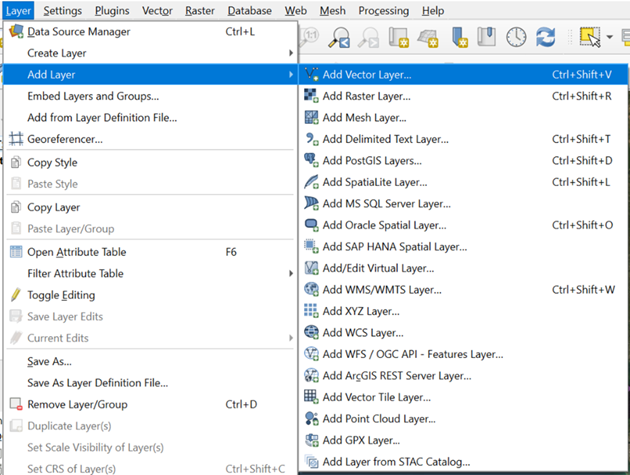
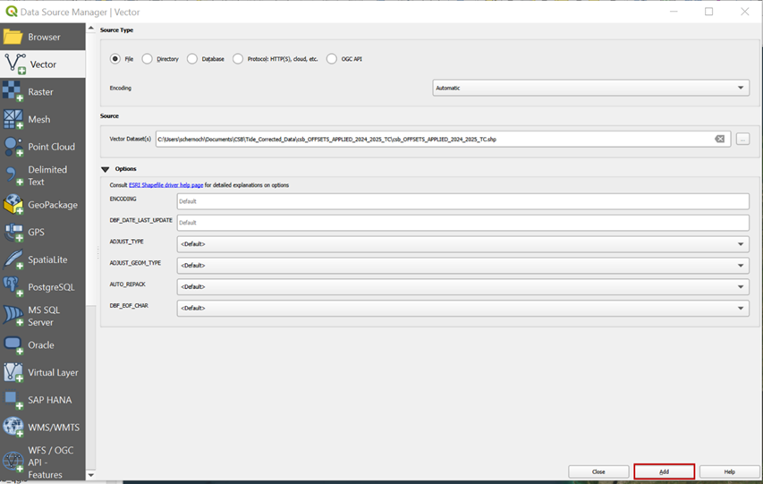
- Under the Layer tab, click Add Layer and select 'Add Vector Layer.'
- In the Source box, enter the path to the tide-corrected CSB .shp file you wish to visualize, and click 'Add.'
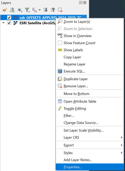
- In the Layers panel, right click on the layer you just added, and select 'Properties.'
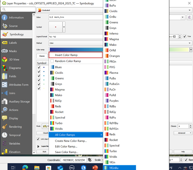
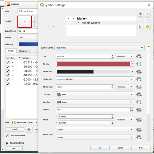
- In the Symbology window, set the symbol type to Graduated, Value to depth, Color ramp to YlGnBu (and inverted), and set the classification Mode, Values, and Legend to best suit the range and distribution of your dataset. Click 'Apply' to confirm changes.
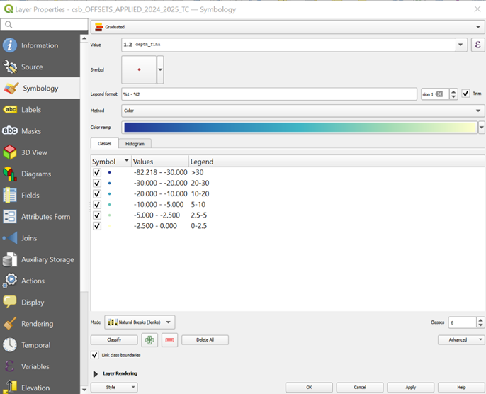
- Click on the Symbol icon to adjust symbol settings. Set the Size to 1 and the Stroke color to transparent. Click 'OK' to apply changes.
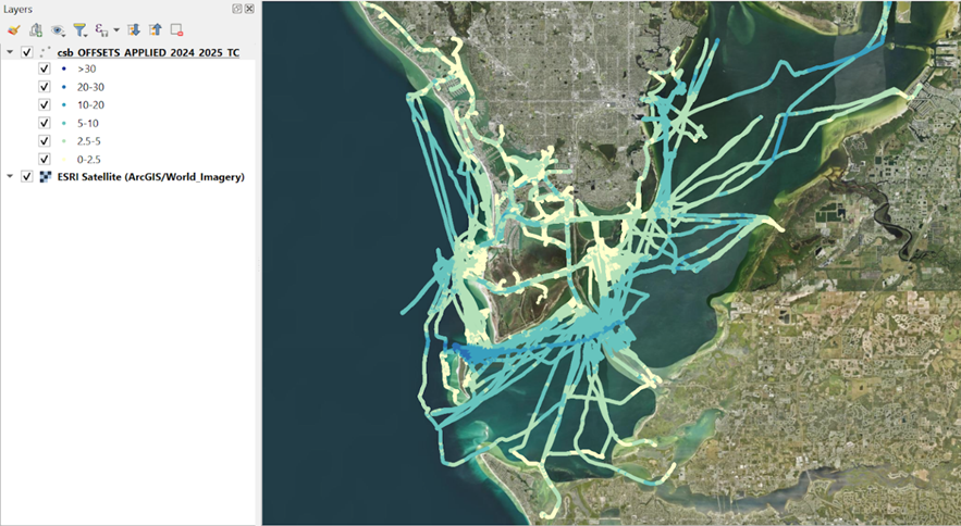
You should now have a well-symbolized, tide-corrected CSB data layer to work with.
If you're feeling tech-savvy and interested in overlaying CSB data onto a NOAA Electronic Navigational Chart for comparison, you can locate and download the appropriate charts here and follow these instructions to display them in QGIS.